
Hello and welcome to my blog :) I have a recent sample to share with you today that I created for the Chocolate Baroque Seaside shows in December. These gorgeous stamps were a delight to work with - they really took me away from the frantic countdown to Christmas! I have used stamps from the Seaside Dreams and Seashore Scenes sets; colouring pencils, Sepia Versafine ink, Vintage Photo Distress ink and gold marker pen.
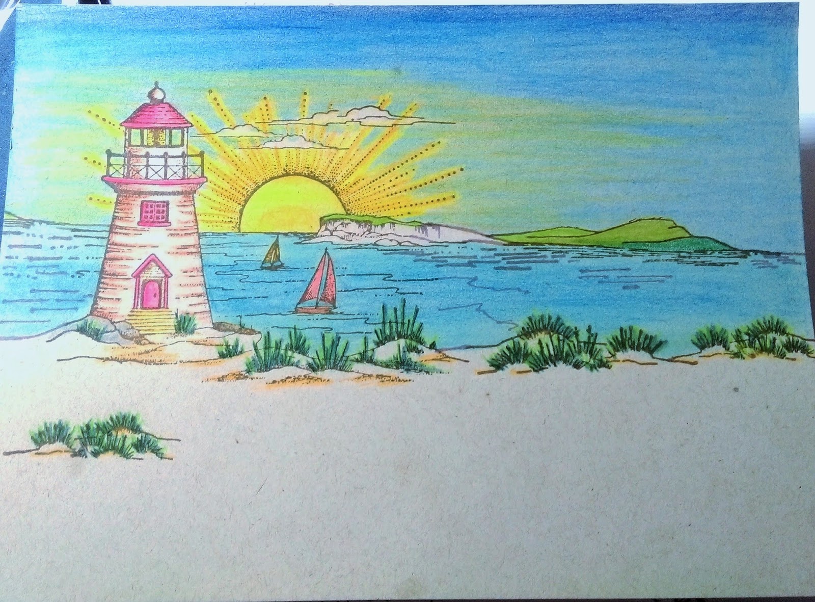
I took a piece of Neenah Dessert Storm card to create my focal panel on. I love Kraft card and this card is especially for inks, alcohol pens, colouring pencils and crayons, which I also love! I wanted a Vintage postcard effect so I decided to use pencils. I stamped several images from the Seaside Scenes set to create a scene using Sepia ink. Not only does the Sepia ink look really good on this card, it helps to create the Vintage effect.

I love colouring so this next bit was a joy to do. It doesn't matter where you start but I like to start by colouring the main focal image first, in this case the lighthouse. I decided to use the colour of the card as the colour of the stone that the lighthouse was made of. Chocolate Baroque stamps always have an indication of where the shading is so I added a slightly darker tone than the card colour as shading. As the sun is already positioned in the picture it is easy to see which direction the light is coming from.

I then coloured the background. I wanted to create a beautiful sunrise/sunset scene on a lovely warm summer day, so I coloured the sun and rays with several shades of yellow and orange, adding them to the blue sky too. The colours are quite muted because I'm using Kraft card, but it helps to create the Vintage postcard look too. I used the colour of the card for the sand too.

I took a white base card and stamped the shells from the Seaside dreams set. I stamped them with DI along the top edge of the card and used water and a small brush to drag the ink out and semi colour them. I wanted the shells to look natural and resemble an old sepia photo. I did the same along the bottom of the card.


I stamped a sentiment 'in the sand' and added the seagull in the bottom corner. I coloured him in with the pencils - he's called Frank by the way. I added gold pen around the edges of the panel and matted it onto dark brown card. I then added it to the base card.


I absolutely love this card! The result is just as I wanted - an old, Vintage Seaside postcard. The sun is shining, the sails are billowing, and Frank is enjoying the view from the beach! This card would suit any occasion, and recipients of any age would instantly be transported to a lovely day at the beach.
Thank you very much for dropping by today, I hope you have enjoyed this post, and that you will pop in again soon :)
Fabulous work Penny, love the designs and the beach images, as always your colours are amazing.
ReplyDeleteI'm going to give applying to CB as a GDT a go, I'd just love to be part of it all, nothing ventured nothing gained, Kate x
Hi Kate, thank you so much for your kind words :) YES! You should absolutely apply for the CBGDT! I was going to suggest it if you hadn't :) Good luck lovely lady xxx
ReplyDelete